Crafting a family legacy through wine
A father-son passion project, nine years in the making. Designing a timeless brand rooted in tradition, craft, and persistence.
CONTEXT
A wine that started as a conversation
This isn’t a client project. Jollymour Wines is something my dad and I built together over nearly a decade. It started the way most good things do: a shared interest and a loose idea. We both loved wine, especially Napa Valley Cabernet. We’d visit the valley together, talk about what we were drinking, what we liked, what we didn’t.
At some point, the question shifted from “what should we drink?” to “what if we made our own?” That question became Jollymour Wines.
Create a wine we love drinking. One that captures the role wine has always held in our family.
THE JOURNEY
Nine years of fires, pauses, and persistence
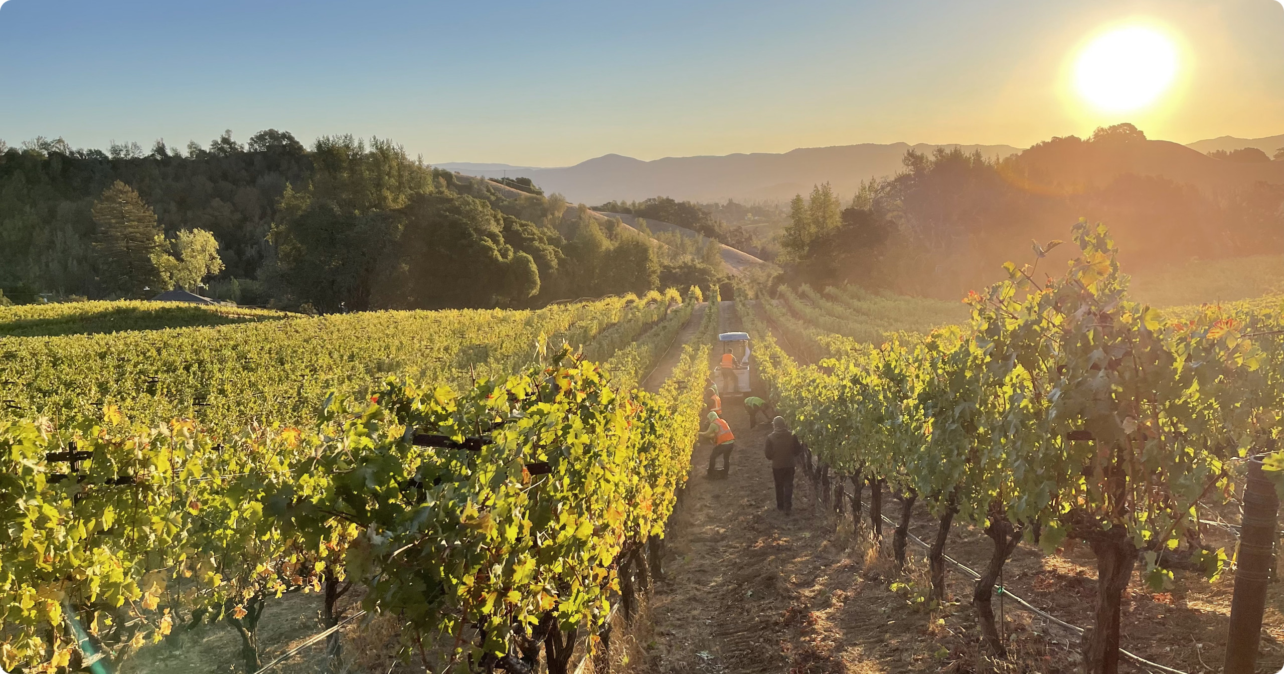
We started in 2015, working with different winemakers. The first few vintages didn’t meet the quality we were aiming for. In 2017, wildfires destroyed the harvest entirely. In 2020, COVID paused production. The winery we rented space from was eventually bought out and gutted. It was a reminder that in Napa, small producers like us operate in a landscape built for billionaires.
Winemaking is physical work. Early mornings, hauling grapes, monitoring fermentation, waiting. Our Cabernet aged in French oak barrels, and we tasted regularly to know when it was ready. There’s no shortcut through that process.
Through all of it, we stayed focused on what we could control: the quality of our grapes, our process, and our persistence. The fires taught us about sourcing. The failed vintages taught us about standards. The buyout taught us about adaptability. In 2021, we finally bottled the wine we’d envisioned from the start.
2015
First Grapes
Began sourcing Napa Cabernet grapes
2017
Wildfire
Harvest destroyed by Napa fires
2020
COVID Pause
Production halted. Winery bought out.
2021
Bottled
First perfected vintage produced
2025
Double Gold
SF Chronicle Wine Competition
DESIGNING THE BRAND
Bold, classic, deeply personal
As the wine took shape, so did our vision for the brand. We wanted something that felt timeless, not trendy. Something that would look at home on a shelf in Napa alongside bottles from producers who have been doing this for generations.
The direction was clear: rich tones, refined typography, minimal design that lets the wine speak for itself. Every decision was filtered through one question: does this feel like us? The brand needed to be sophisticated without being pretentious, bold without being loud. It needed to feel like the Cabernet itself: deep, rich, and well-rounded.
Brand palette
#661416
Wine
Primary accent
#505524
Olive
Secondary accent
#F1F1F1
Cream
Label background
#3D3D3D
Charcoal
Body text
#32332D
Dark Green
Deep accent
#231F20
Near Black
Headings
Timeless over trendy
Every decision was filtered through longevity. Would this still look right in ten years?
Let the wine speak
Minimal design that puts the product first. The bottle is the hero, not the label.
Personal, not precious
Sophisticated without being pretentious. Bold without being loud. Like the wine itself.
BUILDING THE LOGO
Finding the right script
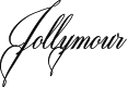
We wanted an elegant cursive script to reflect the sophistication of the wine. I explored dozens of typefaces before landing on Milton Two Bold as the foundation. It had the right balance of flourish and restraint.
From there, I altered every letterform. The final Jollymour wordmark is fully custom lettering built on that foundation, not the typeface straight from the family. The “J” got the most attention. It needed to feel like a signature, something personal and distinctive. We explored floral and vine motifs early on, drawing from traditional wine label aesthetics, but ultimately stripped them away. The name was enough. Simplicity won.
SHAPING THE LABEL
From “ex libris” to something timeless
The label went through its own journey. I started by exploring textured backgrounds inspired by worn, older paper, setting the tone for something that felt aged and elegant.
The most interesting detour was an “ex libris” concept, treating each label as a page from the vintage’s book. I added a dog-eared corner and page numbering to emphasize the handcrafted, personal nature of each bottle. It was unique, but ultimately too literal.
I refined the label by stripping the book-like details while keeping the bottle numbering. That small touch maintained the personal connection without the heavy-handedness. The final label balances the textured background, the script logo, and just enough information to feel classic.
Jolie Amour de la Vie
From our family to yours
The back label carries the phrase that means everything to this project. “Beautiful love of life.” It’s a dedication to my family and to what we built together.
THE BOTTLE AND CAPSULE
Presence on the shelf
Selecting the bottle was critical. We chose a tall, hefty shape with bold shoulders. The weight and structure mirror the wine itself: a rich, full-bodied Cabernet that commands attention.
For the capsule, we went black on black. Subtle, understated. The full “Jollymour” script was too small to read at that scale, so I used just the “J” monogram. It’s the kind of detail most people will never notice, but it matters to us.
GOING TO PRINT
From screen to bottle
Once the design was finalized, I worked closely with MTC Global Label Solutions to bring it to life. We selected a cotton courtyard stock that matched the textured, aged feel of the digital design. The Jollymour script got a D-emboss treatment for depth, with a D-deboss texture across the background. Foil finishing on the vintage year added a subtle warmth.
Tailoring dimensions to the specific bottle shape meant accounting for the taper at the shoulders. Seeing the digital design become a physical label you could hold and feel was one of the most satisfying moments of this entire project.
WEBSITE
Dark, rich, and minimal
The website mirrored the brand. Set against a black background, the bottle became the focal point. Our story unfolded across the site, inviting visitors into the journey and making the family connection feel tangible. Everything was designed to feel like the wine itself: elegant, confident, and personal.
THE RESULT
Double Gold. 95 points.
In 2025, after nearly a decade of work, our 2021 Cabernet Sauvignon won a Double Gold at the San Francisco Chronicle Wine Competition and was awarded 95 points by Wine Enthusiast, one of the most respected wine publications in the world.
The review described it as “dark purple in the glass” with “aromas and flavors of black currant, plum and desert spice carried by a lush mouthfeel and lengthy, firm finish.” That validation was not the goal. The goal was always to make a wine we loved drinking. But having it recognized by critics who didn’t know our story, who just tasted the wine on its own merit, meant everything.
REFLECTION
Resilience is a design skill
Jollymour Wines taught me that resilience is a design skill. Not every project has a clean timeline or a guaranteed outcome. This one had fires, failed vintages, a pandemic, and a winery that disappeared. We kept going anyway.
The commitment to quality over convenience shaped every decision. We didn’t settle on early vintages that weren’t good enough. We didn’t rush the barrel aging. We didn’t simplify the label when the ex libris concept wasn’t working. We refined it until it was right.
That persistence paid off. Not just in the Double Gold or the 95 points, but in the thing itself: a bottle of wine with our name on it that we’re genuinely proud of. Every detail, from the grapes to the script on the label, reflects what happens when you care enough to keep going.
The process took time. But it was worth it.
Next project
Cashmere AI
Maturing a B2B people-intelligence platform and rebranding it from the name up