
Turning people intelligence into decisions firms can trust
Maturing a live people-intelligence platform so advisors could trust a modeled number enough to act on it.
- Single digits to 273
- peak weekly Discovery searches, overtaking the legacy search
- Hours to 10 minutes
- research per prospect, measured by the advisors doing it
- Every modeled number
- ships with a stated confidence and a way to challenge it
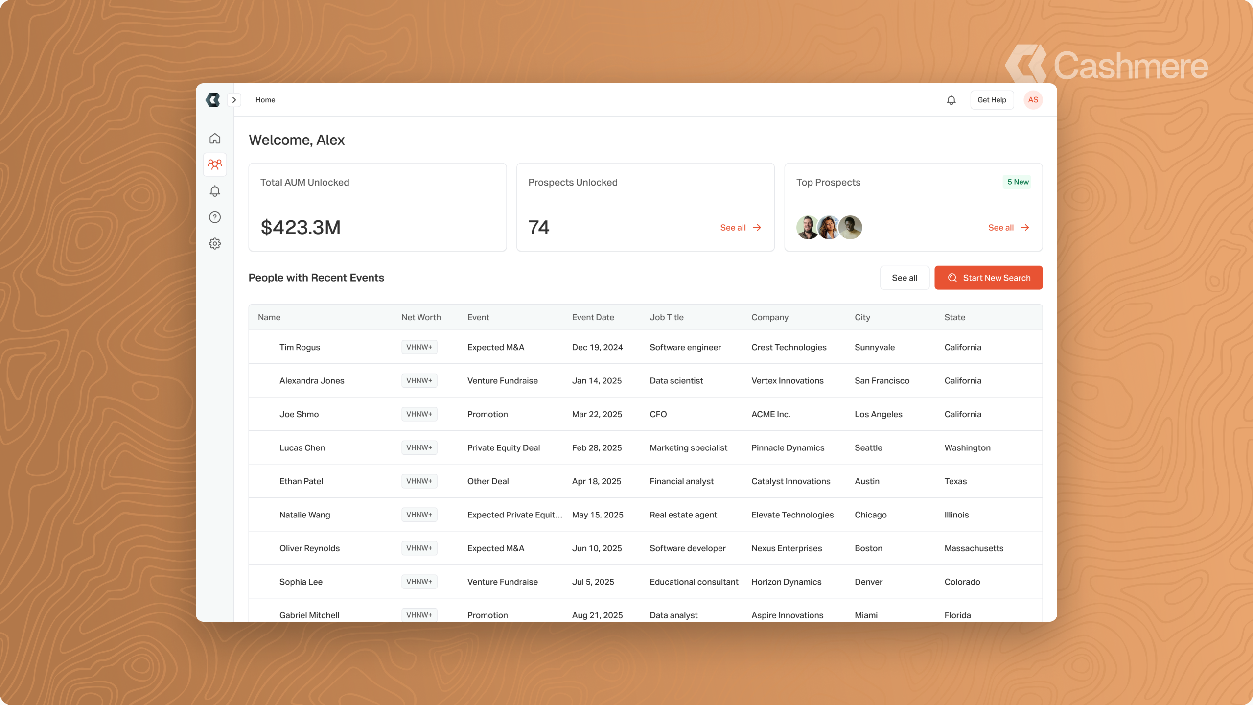
01 · FIND
Surface the right people
Discovery and Lookup, split into two named workflows
02 · UNDERSTAND
See who they actually are
One profile, the person on the left and the judgment on the right
03 · JUDGE
Weigh what they are worth
A conservative base and a modeled range, with stated confidence
04 · ACT
Decide who to pursue
Contact, enrich and export consolidated in the rail
CONTEXT
The platform was already live when I got there
Cashmere is a people-intelligence and data-enrichment platform for financial firms. It was already live with real customers when I joined, so my job was to mature a product, not invent one. Our design partner was a wealth management firm, which gave me a real user to design for: an advisor deciding who to pursue and how to reach them.
Before adding anything, I studied how the platform managed and surfaced its data, the lists, tables, and scaffolding under every workflow. That’s where the strategy came from.
THE CHALLENGE
Make dense, modeled intelligence something professionals would trust and navigate
Two problems ran through everything. Clarity: the product asked users to move between two different jobs, and when those blurred together people reached for the wrong tool. Trust: our wealth figures are modeled estimates, and one number shown the wrong way is enough for an advisor to stop believing the rest of them.
DISCOVERY VS LOOKUP
Making two jobs feel like two jobs
The platform ran one search for two opposite jobs: resolving a known person from a LinkedIn URL or email, and surfacing new prospects from criteria. I split it into named Lookup and Discovery workflows and let the required fields reinforce the split, so the form itself tells you which job you’re in. Discovery went from single digits to a peak of 273 weekly searches, overtaking the legacy search it replaced.
THE PROFILE PAGE
The person on the left, the judgment on the right
THE PROBLEM
The profile kept absorbing new kinds of information: bio, wealth estimates, relationships, address history and home worth estimates. Every addition competed for the same screen real estate, key facts kept sliding below the fold, and the modeled insights carried no signal of how much to trust them. The page had to stay efficient as it grew, and it had to help an advisor judge the data, not just read it.
THE SOLUTION
I redesigned the page around efficiency and trust. The left column organizes the person into categorical tabs: about, wealth, work and education, highlights, trigger events, priority score, with the bio backed by a sources dropdown and address history carrying home worth estimates. A slimmed banner surfaces priority, net worth, and data confidence at the top and returns the fold to the content. The right rail consolidates the quick actions, enrich, export, and contact, with the context that earns trust: confidence explained in tiers with a path to report inaccuracy, the priority score reasoned step by step, contact within reach, and citations designed as the rail’s next resident. Banner badges act as an index into the rail: click one and its card takes focus.
THE RESULT
The profile absorbed far more insight without becoming harder to read: more of the person visible above the fold, the actions and the context an advisor needs consolidated in one rail, and every modeled number arriving with a stated confidence and a way to challenge it. It replaces hours of manual research per person with one page an advisor can act on, and it tells them how much to trust what they are acting on. One tab inside that profile stayed harder than the rest. Every advisor wants the same thing about a prospect, a net worth figure, and that is the one number we could not simply state.
“I spent all week doing a disgusting amount of research on this guy. Deep research spits out 10 pages worth of crap. Had I had a dashboard like this, it would have been a lot easier to digest.”
Wealth advisor, global private bank
WEALTH INSIGHTS
Designing a modeled number people would trust
THE PROBLEM
Our wealth figures are modeled estimates. Nobody hands us a bank statement. Stakeholders wanted a hard number to ground a prospect, but net worth is hard to pin down, and a single confident figure implies a precision we do not have. Show it wrong and an advisor stops trusting the platform.
THE SOLUTION
I worked closely with our design partner to land on a base and a range. A conservative estimate sets a floor we can stand behind from observed assets and income, and a modeled projection shows the realistic upper range from peer and demographic data. The two are labeled distinctly and paired with how complete the underlying data is, so an advisor gets the number they asked for without mistaking an estimate for a fact.
THE RESULT
Advisors got a figure they could open a conversation with, and the base-and-range treatment held up across every wealth tier, from mass affluent to exceptional. In user research across nine advisors and operators, wealth data was the category described as most transformative to their workflow.
“If you can know this before you go after somebody, you can be unbelievably targeted. Estimated household income, asset breakdown. This is like the holy grail.”
Wealth strategy lead, global private bank
INFORMATION MANAGEMENT
The unglamorous tools people used every day
Beyond the headline workflows, I worked on the tools users are in every day: bulk CSV enrichment so a whole list is matched and enriched in one pass, customizable result tables sorted by what drives the decision, and saved searches so a strong prospecting query can be reused instead of rebuilt.
EXPLORATIONS
Exploring several directions before committing to one
I explored multiple directions for every feature I built, then argued for one. Saved searches is one example. A saved search is really a saved set of filters, so the question was where it should live. I tried a few placements, each anchored by the active search name.
What shipped went a different way. The drawer pulls out from the filters with the active search name at the top of the filter panel, because what you are saving is the filter configuration. Keeping it with the filters made that relationship obvious.
WEBSITE & BRAND
An identity rooted in the name itself
The old brand looked like every other SaaS site, a bright orange and a dark blue that could have belonged to anything. So I went back to the name. Cashmere is a fiber spun in the high mountains of the Tibetan Plateau and Mongolian Steppe, regions where nothing happens fast, and that gave me somewhere to start that wasn’t a color trend. Mountains carry permanence. Topographic lines turn layered data into hierarchy you can see, and the goat keeps it from feeling clinical. Balancing it was the tricky part: warm, earthy tones that still read as current technology rather than a heritage brand. It had to feel trustworthy and human, which is a lot to ask of a company whose product is modeled data.

Brand palette
#252322
Ink
Charcoal text and structure
#81807E
Stone
Warm neutral ground
#7593A4
Slate
The modern, technical note
#D4915B
Clay
Earthy warmth and accent
#F4F3F1
Bone
Soft, natural surface
OUTCOMES
Adoption climbed, and the work outgrew its first audience
Discovery adoption climbed. Advisors used the wealth work to make decisions, not just to look at a profile. And the modeled insights went further than our first partner, from one wealth manager to financial institutions generally.
REFLECTION
Trust and clarity were the real design problems
I joined a product people already relied on, which meant every change had to earn its place against something that was already working. That was true of the design too. Nobody hands a new designer the keys to a live platform, so I earned that the same way the product had to earn an advisor’s trust: by showing my reasoning, being honest about what I did not know yet, and making every decision easy to check.
Trust is not a feature you ship. It is a hundred small decisions about what you claim, what you admit you do not know, and whether you give someone a way to hold you accountable. In this business the data is the product, and data only creates value when someone trusts it and can act on it. An advisor deciding who to call and how much of their week to spend on a person will not act on a record they do not believe, so a number without a confidence signal is just a guess with good typography. That is why the platform learned to say what it knows, show where it came from, and be plain about how sure it is, and why the brand had to carry the same steadiness.
I came in reading the system and left shaping how the product presents what it knows, arguing for the harder honest answer over the cleaner confident one, alongside a PM and engineers who had to believe in the reasoning before any of it shipped. The platform and the company’s identity both matured on trust. So did I.
Next project
Momentum AI
Enabling no-code users to build smarter, more adaptive workflows with AI